---
title: "Tooltips for ggalluvial plots in Shiny apps"
author: "Quentin D. Read"
date: "`r Sys.Date()`"
output:
rmarkdown::html_vignette:
self_contained: no
runtime: shiny
vignette: >
%\VignetteIndexEntry{ggalluvial in Shiny apps}
%\VignetteEngine{knitr::rmarkdown}
\usepackage[utf8]{inputenc}
---
```{r setup, echo = FALSE, message = FALSE, warning = FALSE}
knitr::opts_chunk$set(fig.width = 6, fig.height = 3, fig.align = "center")
library(ggalluvial)
pdf(NULL)
```
## Problem
In an interactive visualization, it is visually cleaner and better for interpretation if labels and other information appear as "tooltips" when the user hovers over or clicks on elements of the plot, rather than displaying all the labels on the plot at one time. However, the {ggalluvial} package does not natively include this functionality. It is possible to enable this using functions from several other packages. This vignette illustrates how to create Shiny apps that display an alluvial plot with tooltips that appear when the user hovers over two different plot elements: strata created with `geom_stratum()` and alluvia created with `geom_alluvium()`. An example is provided for wide-format alluvial data (the `UCBAdmissions` dataset) and long-format alluvial data (the `vaccinations` dataset).
The tooltips that appear when the user hovers over elements of the plot show a text label and the count in each group. If the user hovers or clicks somewhere inside a ggplot panel, Shiny automatically returns information about the location of the mouse cursor *in plot coordinates*. That means the main work we have to do is to extract or manually recalculate the coordinates of the different plot elements. With that information, we can determine which plot element the cursor is hovering over and display the appropriate information in the tooltip or other output method.
_Note:_ The app demonstrated here depends on the packages {htmltools} and {sp}, in addition of course to {ggalluvial} and {shiny}. Please be aware that all of these packages will need to be installed on the server where your Shiny app is running.
### Hovering over and clicking on strata
Enabling hovering over and clicking on strata is straightforward because of their rectangular shape. We only need the minimum and maximum `x` and `y` coordinates for each of the rectangles. The rectangles are evenly spaced along the x-axis, centered on positive integers beginning with 1. The width is set in `geom_stratum()` so, for example, we know that the x-coordinates of the first stratum are `c(1 - width/2, 1 + width/2)`. The y-coordinates can be determined from the number of rows in the input data multiplied by their weights.
### Hovering over and clicking on alluvia
Hovering over and clicking on alluvia are more difficult because the shapes of the alluvia are more complex. The default shape of the polygons includes an `xspline` curve drawn using the {grid} package. We need to manually reconstruct the coordinates of the polygons, then use `sp::pointInPolygon()` to detect which, if any, polygons the cursor is over.
## App with wide-format alluvial data
The app is embedded below, followed by a walkthrough of the source code.
If you aren't connected to the internet, or if you loaded this vignette using `vignette('shiny', package = 'ggalluvial')` rather than `browseVignettes(package = 'ggalluvial')`, the app will not display in the window above. You can view the app locally by running this line of code in your console:
```{r run wide app locally, eval = FALSE}
shiny::shinyAppDir(system.file("examples/ex-shiny-wide-data", package="ggalluvial"))
```
## Structure of the example app
Here, we will go over each section of the code in detail. The full source code is included in the package's `examples` directory.
The app first (1) loads the data and (2) builds the plot. Then, (3) information is extracted from the built plot object to (4) manually recalculate the coordinates of the polygons that make up the plot. Internally, {ggalluvial} uses the {grid} package to draw the polygons, so the next steps are (5) to define the minima and maxima of the x and y axes in {grid} units and the units that appear on the plot's coordinate system, and (6) to convert the polygon coordinates from {grid} units plot units. Next, the user interface is defined, including output of (7) the plot image and (8) the tooltip. The final block of code is the server function, which first (9) renders the plot. Finally, the tooltip is defined. This includes (10) logic to determine whether the mouse cursor is inside the plot panel, then (11) whether it is hovering over a stratum, (12) an alluvium, or neither, based on the mouse coordinates provided by Shiny. If the mouse is hovering over a plot element, the app finds appropriate information and prints it in a small "tooltip" box next to the mouse cursor (11b and 12b).
This is the structure of the app in pseudocode.
```{r pseudocode, eval = FALSE}
'<(1) Load data.>'
'<(2) Create "ggplot" object for alluvial plot and build it.>'
'<(3) Extract data from built plot object used to create alluvium polygons.>'
for (polygon in polygons) {
'<(4) Use polygon splines to generate coordinates of alluvium boundaries.>'
}
'<(5) Define range of coordinates in grid units and plot units.>'
for (polygon in polygons) {
'<(6) Convert coordinates from grid units to plot units.>'
}
ui <- fluidPage(
'<(7) Output plot with hovering enabled.>'
'<(8) Output tooltip.>'
)
server <- function(input, output, session) {
output$alluvial_plot <- renderPlot({
'<(9) Render the plot.>'
})
output$tooltip <- renderText({
if ('<(10) mouse cursor is within the plot panel>') {
if ('<(11) mouse cursor is within a stratum box>') {
'<(11b) Render stratum tooltip.>'
} else {
if ('<(12) mouse cursor is within an alluvium polygon>') {
'<(12b) Render alluvium tooltip.>'
}
}
}
})
}
```
### Loading data
The UC-Berkeley admissions dataset, `UCBAdmissions`, is used in this example. After loading the necessary packages, the first thing we do in the app is load the data and coerce from array to data frame.
```{r load dataset, eval = FALSE}
data(UCBAdmissions)
ucb_admissions <- as.data.frame(UCBAdmissions)
```
Next we set `offset`, the distance from cursor to tooltip, in pixels, in both x and y directions. We also set `node_width` and `alluvium_width` here, which are used as arguments to `geom_stratum()` and `geom_alluvium()` below, and again later to determine whether the mouse cursor is hovering over a stratum/alluvium.
```{r set options, eval = FALSE}
# Offset, in pixels, for location of tooltip relative to mouse cursor,
# in both x and y direction.
offset <- 5
# Width of node boxes
node_width <- 1/4
# Width of alluvia
alluvium_width <- 1/3
```
### Drawing the plot and extracting coordinates
Next, we create the `ggplot` object for the alluvial plot, then we call the `ggplot_build()` function to build the plot without displaying it.
```{r draw and build plot, eval = FALSE}
# Draw plot.
p <- ggplot(ucb_admissions,
aes(y = Freq, axis1 = Gender, axis2 = Dept)) +
geom_alluvium(aes(fill = Admit), knot.pos = 1/4, width = alluvium_width) +
geom_stratum(width = node_width, reverse = TRUE, fill = 'black', color = 'grey') +
geom_label(aes(label = after_stat(stratum)),
stat = "stratum",
reverse = TRUE,
size = rel(2)) +
theme_bw() +
scale_fill_brewer(type = "qual", palette = "Set1") +
scale_x_discrete(limits = c("Gender", "Dept"), expand = c(.05, .05)) +
scale_y_continuous(expand = c(0, 0)) +
ggtitle("UC Berkeley admissions and rejections", "by sex and department") +
theme(plot.title = element_text(size = rel(1)),
plot.subtitle = element_text(size = rel(1)),
legend.position = 'bottom')
# Build the plot.
pbuilt <- ggplot_build(p)
```
Now for the hard part: reverse-engineering the coordinates of the alluvia polygons. This makes use of `pbuilt$data[[1]]`, a data frame with the individual elements of the alluvial plot. We add an additional column for `width` using the value we set above, then split the data frame by group (groups correspond to the individual alluvium polygons). We apply the function `data_to_alluvium()` to each element of the list to get the coordinates of the "skeleton" of the x-spline curve. Then, we pass these coordinates to the function `grid::xsplineGrob()` to fill in the smooth spline curves and convert them into a {grid} object. We pass the resulting object to `grid::xsplinePoints()`, which converts back into numeric vectors. At this point we now have the coordinates of the alluvium polygons. The object `xspline_points` is a list with length equal to the number of alluvium polygons in the plot. Each element of the list is a list with elements `x` and `y`, which are numeric vectors.
```{r get xsplines and draw curves, eval = FALSE}
# Add width parameter, and then convert built plot data to xsplines
data_draw <- transform(pbuilt$data[[1]], width = alluvium_width)
groups_to_draw <- split(data_draw, data_draw$group)
group_xsplines <- lapply(groups_to_draw,
data_to_alluvium)
# Convert xspline coordinates to grid object.
xspline_coords <- lapply(
group_xsplines,
function(coords) grid::xsplineGrob(x = coords$x,
y = coords$y,
shape = coords$shape,
open = FALSE)
)
# Use grid::xsplinePoints to draw the curve for each polygon
xspline_points <- lapply(xspline_coords, grid::xsplinePoints)
```
The coordinates we have are in {grid} plotting units but we need to convert them into the same units as the axes on the plot. We do this by determining the range of the x and y-axes in {grid} units (`xrange_old` and `yrange_old`). Then we fix the range of the x axis as 1 to the number of strata, adjusted by half the alluvium width on each side. Next we fix the range of the y-axis to the sum of the counts across all alluvia at one node.
```{r get coordinate ranges, eval = FALSE}
# Define the x and y axis limits in grid coordinates (old) and plot
# coordinates (new)
xrange_old <- range(unlist(lapply(
xspline_points,
function(pts) as.numeric(pts$x)
)))
yrange_old <- range(unlist(lapply(
xspline_points,
function(pts) as.numeric(pts$y)
)))
xrange_new <- c(1 - alluvium_width/2, max(pbuilt$data[[1]]$x) + alluvium_width/2)
yrange_new <- c(0, sum(pbuilt$data[[2]]$count[pbuilt$data[[2]]$x == 1]))
```
We define a function `new_range_transform()` inline and apply it to each set of coordinates. This returns another list, `polygon_coords`, with the same structure as `xspline_points`. Now we have the coordinates of the polygons in plot units!
```{r transform coordinates, eval = FALSE}
# Define function to convert grid graphics coordinates to data coordinates
new_range_transform <- function(x_old, range_old, range_new) {
(x_old - range_old[1])/(range_old[2] - range_old[1]) *
(range_new[2] - range_new[1]) + range_new[1]
}
# Using the x and y limits, convert the grid coordinates into plot coordinates.
polygon_coords <- lapply(xspline_points, function(pts) {
x_trans <- new_range_transform(x_old = as.numeric(pts$x),
range_old = xrange_old,
range_new = xrange_new)
y_trans <- new_range_transform(x_old = as.numeric(pts$y),
range_old = yrange_old,
range_new = yrange_new)
list(x = x_trans, y = y_trans)
})
```
### User interface
The app includes a minimal user interface with two output elements.
```{r ui, eval = FALSE}
ui <- fluidPage(
fluidRow(tags$div(
style = "position: relative;",
plotOutput("alluvial_plot", height = "650px",
hover = hoverOpts(id = "plot_hover")
),
htmlOutput("tooltip")))
)
```
The elements are:
- a `plotOutput` with the argument `hover` defined, to enable behavior determined by the cursor's plot coordinates whenever the user hovers over the plot.
- an `htmlOutput` for the tooltip that appears next to the cursor on hover.
The elements are wrapped in a `fluidRow()` and a `div()` tag.
_Note:_ This vignette only illustrates how to display output when the user hovers over an element. If you want to display output when the user clicks on an element, the corresponding argument to `plotOutput()` is `click = clickOpts(id = "plot_click")`. This will return the location of the mouse cursor in plot coordinates when the user clicks somewhere within the plot panel.
_Also Note:_ In the example presented here, all of the plot drawing and coordinate extracting code is outside the `server()` function, because the plot itself does not change with user input. However if you are building an app where the plot changes in response to user input, for example a menu of options of which variables to display, the plot drawing code has to be inside the `renderPlot()` expression. This means that the coordinates may need to be recalculated each time the user input changes as well. In that case, you may need to use the global assignment operator `<<-` so that the coordinates are accessible outside the `renderPlot()` expression.
### Server function
In the server function, we first call `renderPlot()` to draw the plot in the app window.
```{r renderPlot, eval = FALSE}
output$alluvial_plot <- renderPlot(p, res = 200)
```
Next, we define the tooltip with a `renderText()` expression. Within that expression, we first extract the cursor's plot coordinates from the user input. We determine whether the cursor is hovering over a stratum and if so, display the appropriate tooltip.
If the mouse cursor is not hovering over a stratum, we determine whether it is hovering over an alluvium polygon and if so, display different information in the tooltip.
If the mouse cursor is hovering over an empty region of the plot, `renderText()` returns nothing and no tooltip appears.
Let's take a deeper dive into the logic used to determine the text that appears in the tooltip.
First, we check whether the cursor is inside the plot panel. If it is not, the element `plot_hover` of the input will be `NULL`. In that case `renderText()` will return nothing and no tooltip will appear.
```{r, eval = FALSE}
output$tooltip <- renderText(
if(!is.null(input$plot_hover)) { ... }
...
)
```
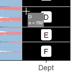
#### Hovering over a stratum
Next, we check whether the cursor is over a stratum. We round the x-coordinate of the mouse cursor in data units to the nearest integer, then determine whether the x-coordinate is within `node_width/2` of that integer. If so, the mouse cursor is horizontally within the box. Here the `if`-`else` statement includes behavior to display the tooltip for a stratum if true, and an alluvium if false.
```{r, eval = FALSE}
hover <- input$plot_hover
x_coord <- round(hover$x)
if(abs(hover$x - x_coord) < (node_width / 2)) { ... } else { ... }
```
If the condition is true, we need to find the index of the row of the input data that goes with the stratum the cursor is on. The data frame `pbuilt$data[[2]]` includes columns `x`, `ymin`, and `ymax` that define the x-coordinate of the center of the stratum, and the minimum and maximum y-coordinates of the stratum. We find the row index of that data frame where `x` is equal to the rounded x-coordinate of the cursor, and the y-coordinate of the cursor falls between `ymin` and `ymax`.
```{r, eval = FALSE}
node_row <-
pbuilt$data[[2]]$x == x_coord & hover$y > pbuilt$data[[2]]$ymin & hover$y < pbuilt$data[[2]]$ymax
```
To find the information to display in the tooltip, we get the name of the stratum as well as its width from the data in `pbuilt`.
```{r, eval = FALSE}
node_label <- pbuilt$data[[2]]$stratum[node_row]
node_n <- pbuilt$data[[2]]$count[node_row]
```
Finally, we render a tooltip using the `div` tag. We provide the text to display as arguments to `htmltools::renderTags()`. We also paste CSS style information together and pass it to the `style` argument. Note that the tooltip positioning is provided in CSS coordinates (pixels), not data coordinates. This does not require any additional effort on our part because `plot_hover` also includes an element called `coords_css`, which contains the mouse cursor location in pixel units.
```{r render strata tooltip, eval = FALSE}
renderTags(
tags$div(
node_label, tags$br(),
"n =", node_n,
style = paste0(
"position: absolute; ",
"top: ", hover$coords_css$y + offset, "px; ",
"left: ", hover$coords_css$x + offset, "px; ",
"background: gray; ",
"padding: 3px; ",
"color: white; "
)
)
)$html
```
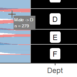
#### Hovering over an alluvium
If the cursor is not over a stratum, the next nested `if`-statement checks whether it is over an alluvium. This is done using the function `sp::point.in.polygon()` applied across each of the polygons for which we defined the coordinates inside the `renderPlot()` expression.
```{r test within polygon, eval = FALSE}
hover_within_flow <- sapply(
polygon_coords,
function(pol) point.in.polygon(point.x = hover$x,
point.y = hover$y,
pol.x = pol$x,
pol.y = pol$y)
)
```
If at least one polygon is beneath the mouse cursor, we locate the corresponding row in the input data and extract information to display in the tooltip. (If the condition is not met, that means the cursor is hovering over an empty area of the plot, so no tooltip appears.)
```{r, eval = FALSE}
if (any(hover_within_flow)) { ... }
```
In the situation where there are more than one polygon overlapping, we get the information for the polygon that is plotted last by calling `rev()` on the logical vector returned by `point.in.polygon()`. This means that the tooltip will display information from the alluvium that appears "on top" in the plot. In this example, we display the names of the nodes that the alluvium connects, with arrows between them, and the width of the alluvium.
```{r info for alluvia tooltip, eval = FALSE}
coord_id <- rev(which(hover_within_flow == 1))[1]
flow_label <- paste(groups_to_draw[[coord_id]]$stratum, collapse = ' -> ')
flow_n <- groups_to_draw[[coord_id]]$count[1]
```
We render a tooltip using identical syntax to the one above.
```{r render alluvia tooltip, eval = FALSE}
renderTags(
tags$div(
flow_label, tags$br(),
"n =", flow_n,
style = paste0(
"position: absolute; ",
"top: ", hover$coords_css$y + offset, "px; ",
"left: ", hover$coords_css$x + offset, "px; ",
"background: gray; ",
"padding: 3px; ",
"color: white; "
)
)
)$html
```
## App with long-format alluvial data
The `vaccinations` dataset is used for long-format alluvial data. The app is embedded at the bottom of this document, but we don't need to walk through the source code because it's almost identical to the code above. The output of `ggplot_build()` that is used to find the polygon coordinates and information for the tooltips has a consistent structure regardless of the initial format of the input data. Therefore, the calculation of polygon coordinates, user interface, and server functions of the two apps are identical. The only difference is in the initial creation of the `ggplot()` object. Refer back to the [primary vignette](ggalluvial.html) for several example plots made both with long and with wide data.
The app is embedded below.
Again, if the app doesn't display in the window above for whatever reason, you can view it locally by running this line of code in your console:
```{r run long app locally, eval = FALSE}
shiny::shinyAppDir(system.file("examples/ex-shiny-long-data", package="ggalluvial"))
```
## Conclusion
This vignette demonstrates how to enable tooltips for {ggalluvial} plots in Shiny apps. This is one of many possible ways to do that. It may not be the optimal way — other solutions are certainly possible!
The full source code for both of these Shiny apps is included with the {ggalluvial} package in the 'examples' subdirectory where the package is installed: the source files are `ggalluvial/examples/ex-shiny-wide-data/app.R` and `ggalluvial/examples/ex-shiny-long-data/app.R`.